
The best church websites in 2026 are not the ones with the biggest budgets. They are the ones that tell a first-time visitor when, where, and what to expect before that visitor has to go looking.
Most lists of church website examples are lists of megachurches. Those sites are impressive, and almost nothing on them can be copied by a church with a part-time office manager and a volunteer who got handed the website login.
We build church websites for churches like these, so we picked 15 we would show a client: Catholic, mainline, Orthodox, evangelical, and non-denominational, most of them small or mid-size. For each, we name what it does well and one thing your church could copy this month.
What the Best Church Websites Have in Common
The best church websites share five habits: service times up front, answers to visitors' real questions, a clear picture of what to expect, one clear next step, and a homepage that stays current.
People do use your website to decide whether to visit. In a 2023 Lifeway Research survey, 37% of Protestant churchgoers who had changed churches relied on church websites in their search. Among those who first found their current church through its website, 67% said beliefs and mission were the most helpful content, followed by location (66%) and worship times (64%). The survey covered Protestants only, but in our experience, Catholic families look up Mass times the same way.
Here's what each habit looks like in practice:
- Service times up front. Day, time, and address sit in the first screen, without a click. Worship times and location were two of the top three answers in Lifeway's survey.
- Answers to visitors' real questions. Parking, the cemetery, a wedding, a child with special needs: the best sites answer the question a visitor is actually asking, before they have to call.
- A clear picture of what to expect. What worship is like, what each gathering is called, and who is welcome. Beliefs and mission topped Lifeway's list, so say them in words a neighbor would understand.
- One clear next step. Not “Get Connected,” but one specific thing to do, ideally with a date on it.
- A homepage that stays current. This Sunday's service and this season's changes. A homepage that matches this week tells a visitor the church is alive.
Speed on a phone, easy giving, and a human About page matter too. Most people search for churches on their phones, as we noted in our church website SEO checklist, so run your homepage through Google's free PageSpeed Insights. Our post on must-have content for a church website covers giving and the About page.
15 Church Website Examples Worth Copying
How we chose: we reviewed each homepage between October 25 and 28, 2026. Every site had to show at least one of the five habits above clearly enough that a volunteer could copy it. We picked across traditions, sizes (mostly small and mid-size), and platforms, from Squarespace and Webflow to eCatholic and WordPress.
Each entry lists the church's tradition, approximate size, and platform, plus which of the five habits it's an example of. Sizes are our estimates from service schedules and campuses, since few churches publish attendance. Several are among the best small church websites we found and work up to large churches.
1. St. Paul’s Church, Nantucket, Massachusetts
stpaulschurchnantucket.org · Episcopal · Small · Ekklesia 360
Best for: small congregations with a simple Sunday schedule
Example of: Service times up front

What it does well: The first button on the page says “Service Times,” the exact words a visitor would type.
What to copy: Label your first button with the words people search for: “Service Times” or “Mass Times.”
2. St. Stephen Byzantine Catholic Church, Allen Park, Michigan
saintstephenbyzantine.church · Byzantine Catholic · Small · WordPress
Best for: small parishes that want everything on one page
Example of: Service times up front

What it does well: One scroll gives the Sunday Divine Liturgy time, confession times, phone, email, address, and a map. A visitor never has to click.
What to copy: List confession times right next to service times. In our experience, Catholic visitors look for both.
3. St. Lydia’s, Brooklyn, New York
stlydias.org · Lutheran (ELCA) · Small · Squarespace
Best for: churches with more than one kind of gathering
Example of: A clear picture of what to expect

What it does well: The homepage names each gathering (Dinner Church, Waffle Church, Tuesday Morning Prayer) with dates, so a visitor can pick the one that fits.
What to copy: If you have more than one kind of gathering, give each a plain name and one line on who it’s for.
4. Old Scotch Church, Hillsboro, Oregon
oldscotchchurch.org · Presbyterian (PC(USA)) · Small · WordPress
Best for: church offices that field the same question every week
Example of: Answers to visitors' real questions

What it does well: Cemetery questions get their own email and phone number right on the homepage, so the church office isn’t fielding them.
What to copy: Answer the question your office gets most, right on the homepage. In our experience, it’s usually parking.
5. Greek Orthodox Church of the Holy Trinity, Charleston, South Carolina
gocharleston.org · Greek Orthodox · Mid-size · Squarespace
Best for: churches whose worship is new to most visitors
Example of: A clear picture of what to expect

What it does well: The About menu has a “For Inquirers” page for people new to Orthodoxy.
What to copy: Write a short page for people unfamiliar with your tradition. It answers the questions they’d feel awkward asking at the door.
6. Cornerstone Houston, Houston, Texas
cornerstonehouston.com · Presbyterian (PCA) · Small · Webflow
Best for: churches meeting in rented space
Example of: Service times up front
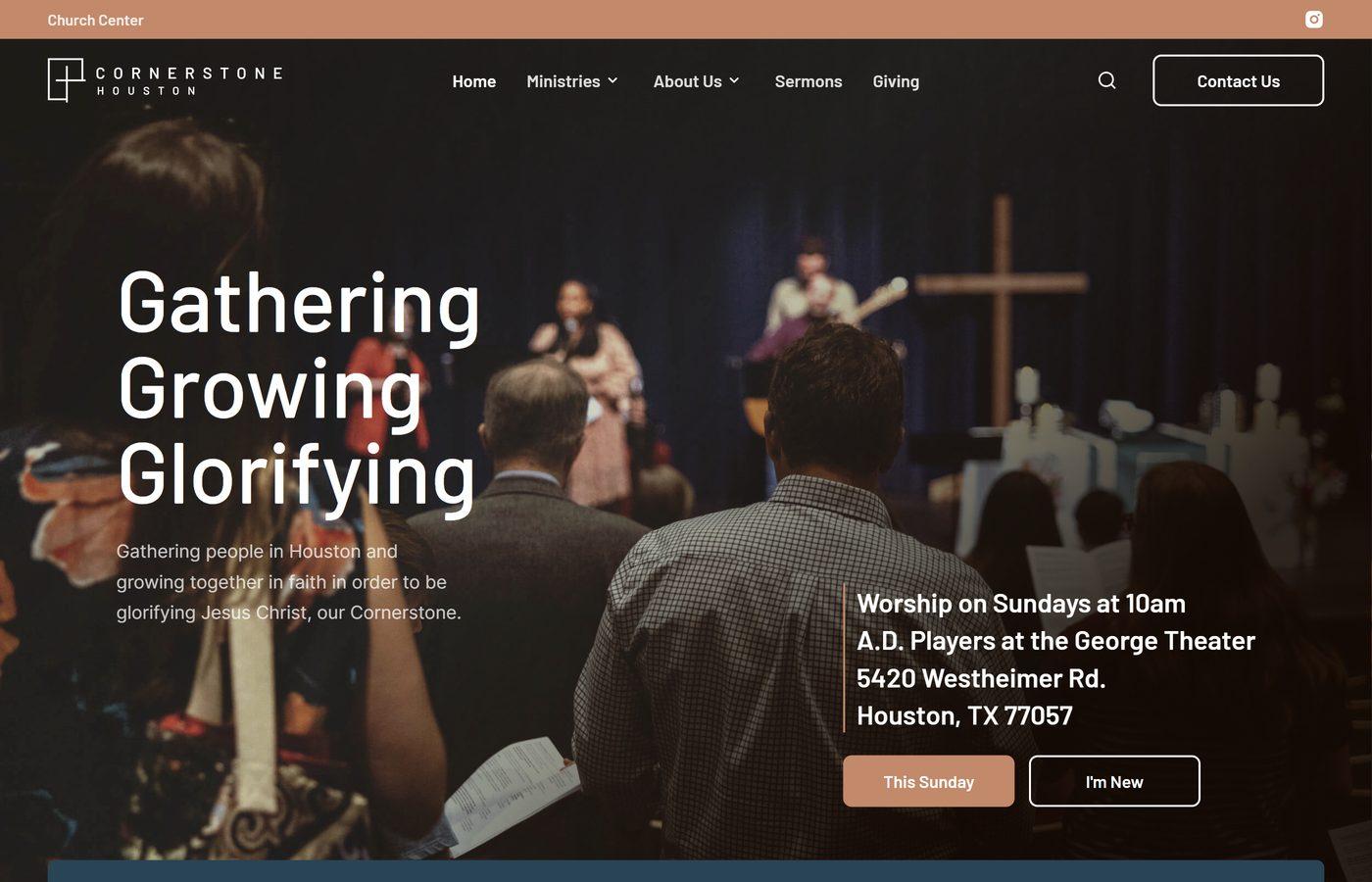
What it does well: The first screen says “Worship on Sundays at 10am” and names the theater and its street address. That matters for a church without its own building.
What to copy: If you rent space, name the building you meet in, in the first screen.
7. Passion Creek Church, Queen Creek, Arizona
passioncreek.church · Non-denominational · Small to mid-size · WordPress
Best for: church plants building a path for newcomers
Example of: One clear next step

What it does well: “Consider Our 3 Invitations” offers three specific next steps: plan a visit, take the “Stick Six” challenge (six Sundays in a row), or join a 20-minute chat with the pastors on the first Sunday of the month.
What to copy: Replace a vague “Get Connected” with one concrete next step that has a date on it.
8. St. Francis of Assisi Catholic Church, Incline Village, Nevada
sftahoe.org · Catholic · Small to mid-size · eCatholic
Best for: parishes in tourist towns or wedding destinations
Example of: Answers to visitors' real questions

What it does well: This Lake Tahoe parish knows who visits its site, so weddings get their own homepage section.
What to copy: Ask who visits your site besides members (engaged couples, grieving families, tourists) and give the biggest group its own homepage section.
9. Council Road Baptist Church, Bethany, Oklahoma
councilroad.church · Baptist · Mid-size · Squarespace
Best for: churches with a special-needs or disability ministry
Example of: Answers to visitors' real questions
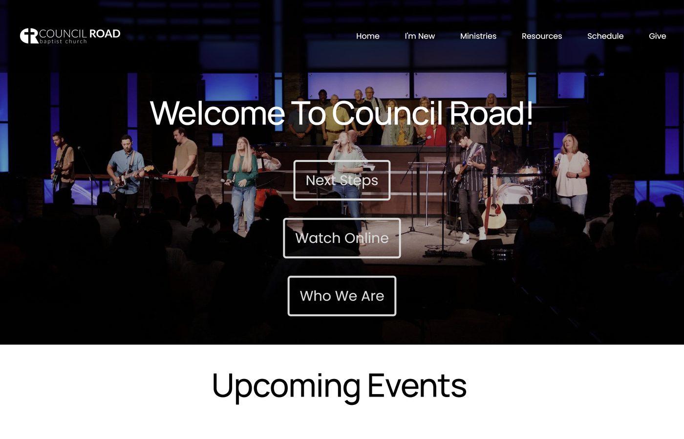
What it does well: Disability Ministry sits in the main Ministries menu, right beside kids and students. A family with a child who has special needs knows before Sunday that there’s a place for them.
What to copy: If you have a ministry for people with disabilities, put it in your main menu where families can find it.
10. Our Lady Star of the Sea Catholic Church, Ponte Vedra Beach, Florida
olsspvb.org · Catholic · Large · eCatholic
Best for: parishes that want their schedule readable by Google
Example of: Service times up front

What it does well: Right under the banner, three columns list Mass, Reconciliation, and Adoration times as plain text. It’s the first thing a visitor scrolls to, and it reads in a few seconds.
What to copy: Post your schedule as text, not as an image of the bulletin. Google and screen readers can read text.
11. Jesus the Divine Word Catholic Church, Huntingtown, Maryland
jesusdivineword.com · Catholic · Mid-size · eCatholic
Best for: Catholic parishes with a busy weekly schedule
Example of: Service times up front

What it does well: One tabbed box holds the Mass schedule, Eucharistic Adoration, Reconciliation, and Today’s Readings. That’s four weekly lookups, one click each.
What to copy: Use tabs to keep a busy Catholic schedule readable on a phone.
12. Five Oaks Church, Woodbury, Minnesota
fiveoaks.church · Non-denominational · Mid-size to large (two campuses) · Squarespace
Best for: reaching people who are still looking for a church
Example of: One clear next step

What it does well: The site offers a free PDF of questions to ask when choosing a church, which helps a reader even if they end up somewhere else.
What to copy: Offer one helpful thing to the visitor who isn’t ready to come yet.
13. Bay Hope Church, Lutz, Florida
bayhope.church · Evangelical (Methodist roots) · Large (three campuses) · Webflow
Best for: multi-campus churches
Example of: A homepage that stays current

What it does well: A “This Sunday” block shows the current series, service times, and where to watch.
What to copy: A “This Sunday” block, updated weekly, shows visitors the site is alive.
14. The Basilica of Saint Mary, Minneapolis, Minnesota
mary.org · Catholic · Large · WordPress
Best for: churches going through a renovation or a move
Example of: A homepage that stays current

What it does well: During a restoration, the banner explains where to go in four words, “Restoring Upstairs, Celebrating Downstairs,” and the Mass schedule right below notes that the upstairs nave is closed.
What to copy: When where-to-go changes, say it on the homepage in one plain sentence.
15. Trinity Church Wall Street, New York, New York
trinitychurchnyc.org · Episcopal · Large · Drupal
Best for: churches ready to try video
Example of: A clear picture of what to expect
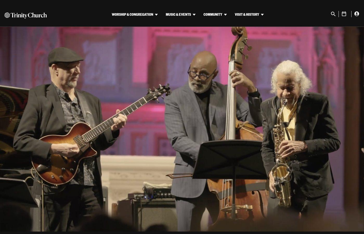
What it does well: The homepage opens with a full-width video that moves quickly through worship, music, and community life, broken up by simple text cards: “You are welcome” and “You belong here.” A visitor sees what to expect before reading a word.
What to copy: A welcome video doesn’t need a production team. A short clip of real Sunday moments shot on a phone, with one line on screen like “You belong here,” shows visitors what to expect.
Church Website Design Tips: What to Copy First
The best church website designs listed above put the visitor's questions ahead of the church's announcements. Here are the same five habits, in the order we'd tackle them:
- Service times up front (St. Paul's, Cornerstone, Our Lady Star of the Sea).
- Answers to visitors' real questions (Old Scotch Church, Council Road).
- A clear picture of what to expect (St. Lydia's, Holy Trinity, Trinity Church).
- One clear next step, ideally with a date (Passion Creek, Five Oaks).
- A homepage that stays current (Bay Hope, the Basilica).
None of these needs a developer. If your site is in need of a full re-do, our church website design page explains how we build sites like these. For the full list of church website must-haves, see our guide to must-have content. For the search side, our step-by-step SEO checklist covers what Google needs to see.
Frequently Asked Questions
What makes the best church website?
It answers when, where, and what to expect in the first screen, on a phone. In our experience, design matters less than people think. A plain site with accurate service times beats a beautiful one with last year's Christmas schedule.
What should a church website include?
At minimum: service times, your address and parking, what to expect on a first visit, what you believe, how to give, and a way to reach a real person. Our guide to church website must-haves walks through each page.
What do the best small church websites have in common?
They do a few things well instead of everything halfway. St. Paul's, St. Lydia's, and Old Scotch Church each answer a visitor's first questions near the top of the page.
Do we need a custom-built site?
No. St. Lydia's, Holy Trinity, and Council Road run on Squarespace. St. Francis, Jesus the Divine Word, and Our Lady Star of the Sea use eCatholic, a platform built for parishes. The content on the page matters more than the platform.
What are the best Catholic church websites doing differently?
They treat Mass, confession, and adoration times as the main event. Look at St. Stephen's in Allen Park, Jesus the Divine Word, and the Basilica of Saint Mary for three ways to do it at three sizes.
Copy One Thing This Month
None of these churches got there in one redesign. They decided who the homepage is for and kept it current. Pick one idea from this list, make the change before Sunday, and ask a friend who has never been to your church to find your service times on their phone.
If you’d like a second set of eyes, we offer a free church website audit. We’ll tell you what’s working, what to fix first, and what you can skip. No pressure, no jargon.
David Graham started Five Loaves Marketing, a church marketing agency dedicated to helping churches and faith-based nonprofits reach those looking for them.
Sources
- Lifeway Research, “Church switchers identify factors behind their decision,” November 9, 2023 (survey of 1,001 U.S. Protestant churchgoers, July 26 to August 4, 2023)
- Church homepages reviewed October 25 to 28, 2026, at the URLs listed above